
Advise TX – Case Study
Challenges
Meeting Notes
Advise TX is a program spearheaded by the College Advising Corps, a non-profit based out of North Carolina. They were looking to build a robust platform for high school seniors to utilize when choosing what colleges they should apply to. I worked with them on the front end UX and UI for this platform along with their development team in London.
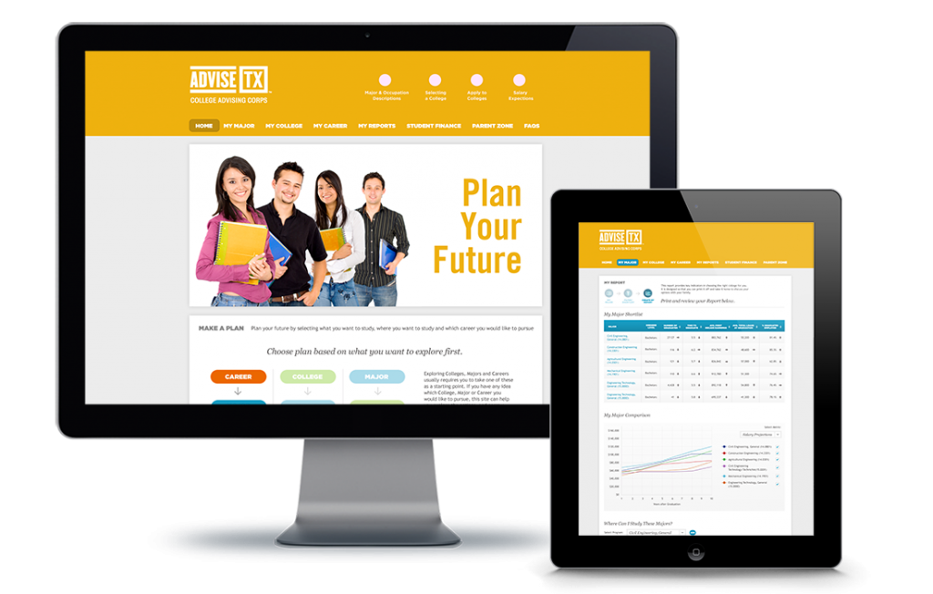
The online tool required users to navigate Advise TX’s vast database of information by three main “starting-points.”
1.) Career
2.) College
3.) Major
Based on the initial “starting-point” users then interact with the platform filling out more information as they go. Once the tool has received the necessary information from the user, a report is generated outlining the key things the user should know about their path to higher education. Designs for all data visualizations in this report had to be dynamic and engaging for the user to make adjustments and reevaluate the data to find their “perfect-fit” path.
Additionally the client wanted multiple Home Page designs to choose/mix-and-match from.
Process


Wireframing
After virtual meetings with teams in North Carolina and London, basic feature set requirements, timeline and budget parameters were established.
Next, wireframes were built out, outlining the user flow based on multiple user-stories. Wireframes were then annotated through a handful of virtual meetings.
After agreeing on a set of wireframes, initial design began off a particular user-story. This flow would follow a student looking to generate a report based on their interest in a particular Major.


Designing
Four home pages and three sub pages were skinned out showcasing the steps required by the student to generate their report.
Home Pages
a.) Based on initial wire framing.
b.) A condensed version.
c.) A graphic heavy approach.
d.) A Parallax slider version.
Sub Pages
a.) Find Major
b.) Filter/Shortlist
c.) Create My Report
Next, the home page style was decided on and sub pages were tweaked as needed over the course of more virtual meetings. Then red-lined skins were sent over to development for working prototypes to be built.
Conclusion
I stayed on to consult as the remaining pages were tackled by internal client teams based on my initial designs.
Overall the project took three weeks and we came in under budget. The client and the development team were happy with the results, the tool was built and the students were able to utilize it for years to come.