
IQumulus – Case Study
Challenges
Meeting Notes
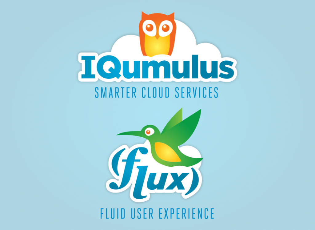
IQumulus was a fresh startup with an idea to revolutionize cloud software-as-a-service. They came to me with an idea they needed branded and then for a user experience to be built around that brand. They wanted their brand to have tie-ins with birds, due to the cloud nature of their platform. Specifically, they wanted an owl to represent their overall brand of IQumulus for its connections to “wisdom” and “smarter thinking,” and a hummingbird to depict their main software, Flux, due to its ultra fast speed and agility.
They wanted the brands to have a “tech” vibe, be modern and unique. For the UX, they wanted to have a very fluid “Parallax” slider single-page experience. The main purpose of the site was to introduce their product and give a quick general overview of the problems their software can solve. The UI was meant to be heavy on custom “tech” iconography and videos elaborating on their new cutting-edge software.
Process
Branding
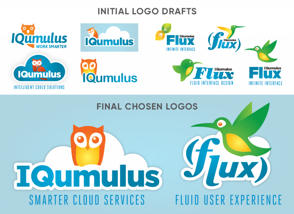
After meeting with the founder of the company, a creative brief was drafted to narrow down the scope of the branding and timeline/budget parameters were established. The brief included a variety of tag lines they wanted to see within the logo options, colors they were interested in exploring and the general elements of: skies, clouds, an owl for IQumulus and a hummingbird for Flux.
The next step was to design a series of logo options for the “main-brand” and the “sub-brand.” I wanted to keep the colors for each distinct, but also ensure they still worked well together. Blue and white were going to be essential “grounding colors” to maintain the birds/sky messaging. After playing around with multiple color combinations, I found that an orange/yellow owl worked well with a green/yellow hummingbird. From a color theory perspective, orange emotes happiness and creativity, perfect for a unique software company that wants to stand out. Green emotes growth/freshness and the sensation of “Go!” perfect for the fast moving hummingbird. Orange and green were also distinct enough from each other to make the two birds stand apart, and the yellow in both helped to keep the two related.
After reviewing the initial concepts with the IQumulus team, elements were discussed at length and a list of favorite elements was generated from each of the logos presented. Out of each of the options presented, the team loved the clouds, one of the owls, one of the hummingbirds, a couple of the typefaces and a couple of orientations. It was clear a second pass that integrated the “favorite” elements successfully could yield the desired look/feel.
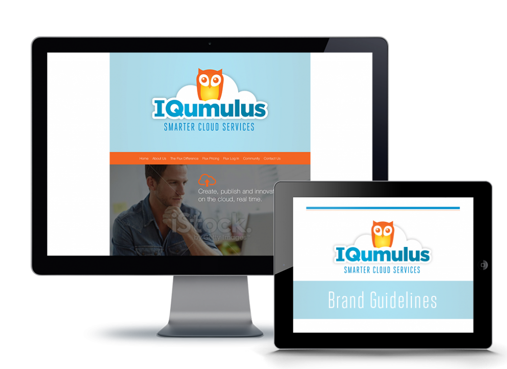
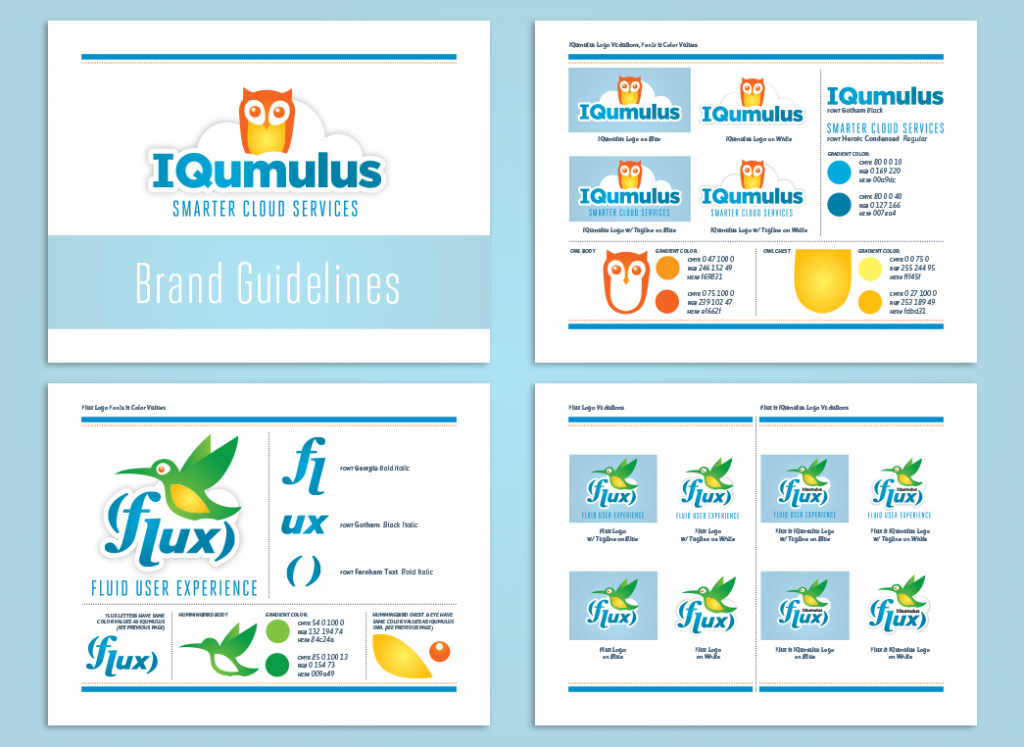
Merged concepts were presented that combined all of those elements. The team unanimously approved the new concepts and we moved into the finalization phase of the branding process. Different iterations of the logos were discussed (i.e. different color backgrounds, options with and without tag lines etc.). After final approval on the logos, a brand guidelines document was created so iteration rules, fonts and color swatches would be carefully regulated as the brand grew into the future. Once the logos were established, we were ready to move onto the UX/UI phase of the project.


UX/UI Designing
A rudimentary wireframe was built out, outlining the user experience based on sketches and a feature-set requirement list from the team at IQumulus. After approval of the wireframe, design began for overall UI of the experience.
The header graphic was designed, with the logo large and centered, followed by graphical “parallax” slider images with custom built icons and text provided by the client.
The next main section was the company’s About Us section and a supplementary video outlining more about the team and business as a whole. This section was followed by another “parallax” image with an icon and text area.
The next section was designed to outline the 7 different “value propositions” of the Flux software difference. The client wanted this area to be very clear and easy to follow. Again custom icons were built out for each of the features. This section was followed by a series of videos that went into more depth on the unique features of the Flux software.
After the features were covered, the pricing table was designed. The client provided an excel document with the required information. This was then re-imagined into a clean, 5-column pricing table, complete with custom icons. Naturally, this section was followed by an area that spoke to the cost effectiveness of the software.
The next area was the client portal area. This is where existing customers could log into the back end portal and new users could sign up for the Flux service.
The website was capped off at the end with a Contact Us form, location map, streaming twitter feed, newsletter sign up, and the footer.
Once this skin was approved, red-lines were sent over to their development team for the prototype to be built.
Conclusion
I stayed on to consult as the remaining pages were developed to ensure accuracy against my designs. After a few UI reviews the prototype was successfully ready to go live.
Overall, the project took five weeks and we came in under budget.