

AT&T & McDonald’s Microsite – Case Study
Goal
From Product Team
- General Overview – To design and develop a microsite for McDonald’s owners/managers to order new service and/or add to existing service.
- Initial Requirements – Will have to include multiple service and hardware installation options. Will need to refine list of available service and hardware options.
- Long Term Scope – Maintain framework to easily change out for other clients
- Prior Attempts – In the past the online ordering flows did not provide enough information to seamlessly allow users to order new service and led to confused customers, internal AT&T billing and account managers as well as 3rd party installers. This has led to a decrease in adoption to our new services and hardware with our McDonald’s customers. Down 23% within the last year.
Roles & Responsibilities
The UX Team
I worked with a team of 3 other UX designers and helped to divide out initial areas of focus:
- Myself and other UX Lead:
- Managed work across all teams (UX, Product, Development).
- Design thinking methodology:
- Empathize. Understood what questions we needed to ask, who we needed to speak to in order to get the best big-picture overview.
- Define. Identified personas, role objectives, decisions, challenges and pain points.
- Ideate. Collaborated with UX team to share ideas for solutions, collected and prioritized potential solutions from idea mapping exercises.
- Prototype. Developed quick information architecture flows and mockups that could be validated with product and development teams as we iterated to ensure solutions were workable.
- Test. Presented mockups to McDonald’s team to ensure solutions were viable. Collected feedback and iterated quickly.
- Design thinking methodology:
- Managed work across all teams (UX, Product, Development).
- UX Designer 3
- Assisted with prototypes and mockups based on initial designed framework.
- Owned customer facing Email portion of product solution.
- UX Designer 4
- Assisted with prototypes and mockups based on initial designed framework.
- Owned UX Copy writing and worked with legal team to approve all final copy.
Challenges
Based on the meeting with Product Owners we needed to better understand what failed previously. We needed to speak to McDonald’s Owners/Managers (end users), internal AT&T billing and account managers and 3rd party installers. We also needed a thorough list of services and hardware available through this microsite. Below is a summary of what we collected from our interviews:
From the McDonald’s Team
- Pricing – Previous ordering flows did not provide transparent pricing models for what was being ordered. (Wi-Fi service charges, Circuit charges, one time fees and monthly fees, across multiple venues.
- Wireless Backup Units – In some cases, venues cannot utilize AT&T cellular service to leverage wireless backup units, will need options to utilize a 3rd party WBU.
- Service/Hardware Transparency – It is too confusing to understand what types of service are available/needed and what types and how many pieces of hardware are needed.
- Mobile Consideration – Prior solutions were not mobile friendly and a lot of users will want to complete the ordering from their mobile devices.
From Installers
- Ceiling Height – Higher ceilings require special ladders that need to be accounted for before installation date.
- Hardware Location – Are the point-of-service patch panels located in the same room as the switch panel? Running wires across multiple rooms take more time and cost more.
- Hardware Type – Are the point-of-service patch panels wall mounted or rack mounted? Wall mounted racks take longer to work on.
- Service Address – Sometimes the wrong addresses were on work orders due to customers using their billing addresses vs service address.
From Billing/Account Team
- Credit Check – Customers need to process a credit check when ordering. They need to know this upfront before they begin ordering solutions.
From Product Team
- Authentication
- Users need to authenticate via AT&T account
- Venues will populate based on their AT&T account
- Services
- Standard traditional site (free standing building)
- Small non-traditional site (locations within other buildings, Walmart, food courts etc)
- Private only wi-fi site (no public wi-fi)
- Site Survey Add-on (For customers that don’t know what they need)
- Hardware
- Standard package (1 Gateway, 1 indoor access point, 1 48-port switch, 1 wireless modem.
- Add-ons
- Include drive-through hand held order taker (HHOT)
- Single switch
- Single indoor access point
- Single outdoor access point
- On-site spare indoor access point
- On-site spare outdoor access point
- On-site spare switch
- On-site spare security appliance
- On-site spare LTE modem
Ideation
The UX Team
What valuable feedback have we received from various teams?
- Our solution needs …
- To be mobile friendly
- Easy option matrices for services and hardware and add-ons
- Transparent pricing summaries
- Accomodation for wireless backup units
- Ceiling height consideration for installers
- Hardware location and type information collection for installers
- Service address validation
- Credit check step
- Ideas for how we achieve solutions …
- Utilize a mobile first approach
- Dynamic Service type and hardware options with information based on selections.
- Restaurant Questionnaire
-
- Can cover ceiling height, and hardware location and type.
- Address validation modal
- Credit check modal
Prototyping
UX Architecting
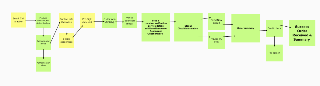
The screens below show the iteration process for how we architected the microsite.
Yellow pages were the ones up for review. Green pages were approved by team members, ready for more detailed prototyping.
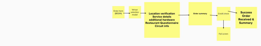
- Round 1
- Initial framework for review
- Presented to product team
- Feedback
- Break out the circuit options as a separate page
- Need to bring in development to talk about authentication
- Rest of flow looks good
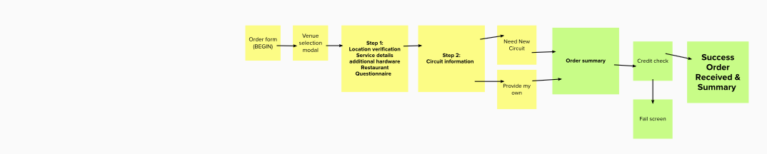
- Round 2
- Addition of seperate circuit selection step
- Presented to product and development teams
- Feedback
- Will need to add pre-authentication pages
- Need to bring in legal to talk e-sign agreement
- Rest of flow looks good
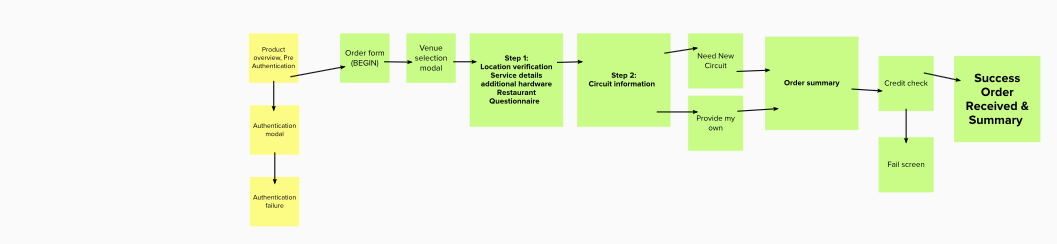
- Round 3
- Addition of pre-authentication pages
- Presented to product and development and legal teams
- Feedback
- Need to add in e-sign agreement before ordering
- Does not address email CTA
- Does not address contact info validation
- Add a pre-flight checklist so users can make sure they have what they need before they get too deep into flow
- Rest of flow looks good
- Round 4
- Addition of Email CTA, Preflight check list, contact info validation and e-sign agreement
- Presented to product, development and legal teams.
- Feedback
- Preflight checklist should go before the contact info validation
- Rest of flow looks good
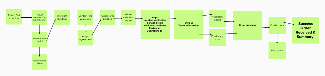
- Round 5
- Re-arranged preflight checklist to go before contact info validation.
- Presented to product and development teams.
- Feedback
- All good, ready for further design.
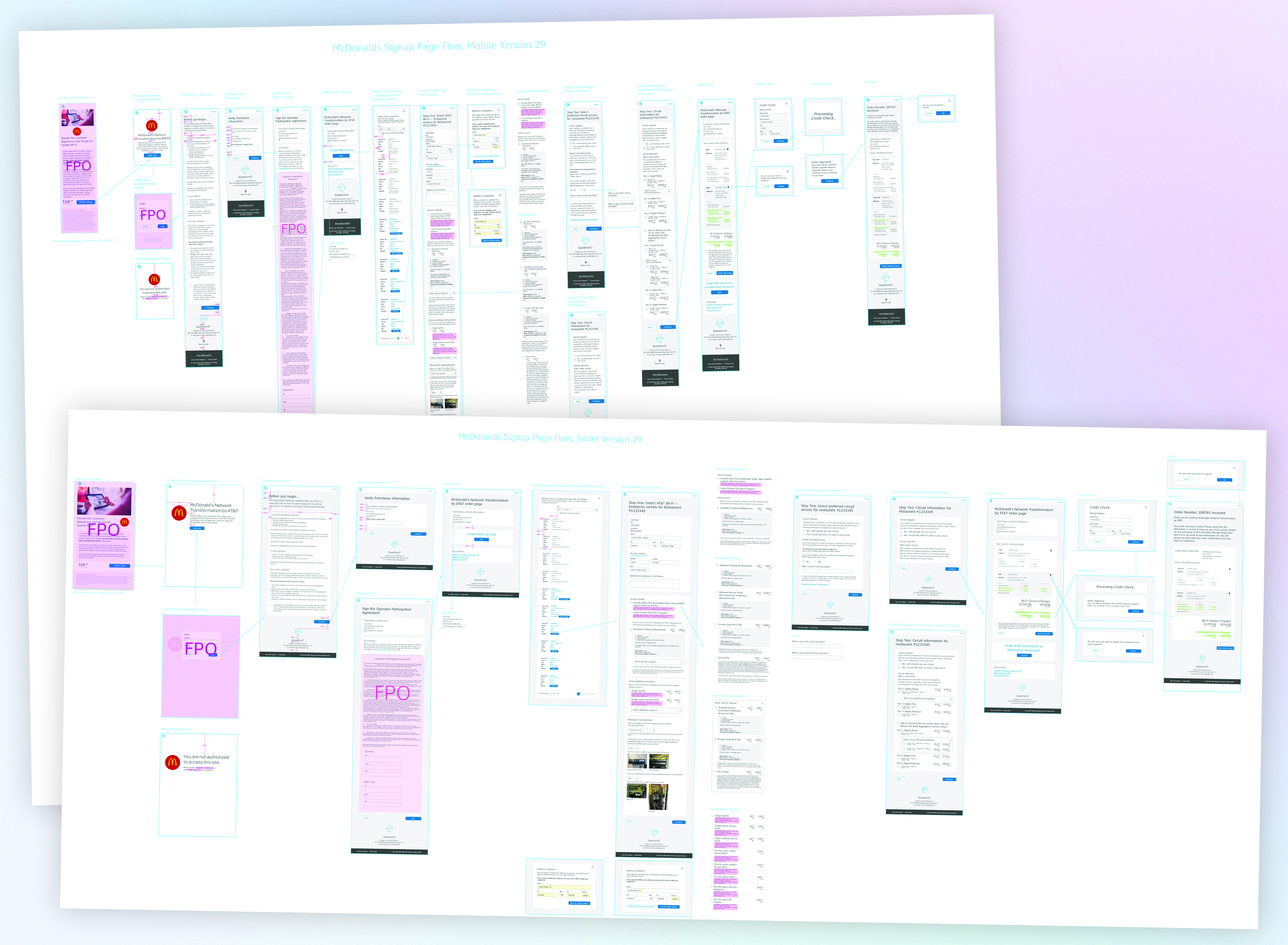
Design, Development & Testing
Design
- Designs for initial pages were made for general look/feel.
- We started with a mobile first approach then tablet/desktop views.
- Multiple rounds of revisions with product and development teams were conducted.
- Final designs here were agreed upon by product and development teams.
- Designs were submitted to the McDonald’s team for review/testing.
- After a few rounds of revisions the McDonald’s team signed off for development.
Development
- Development teams started building our pages based on agreed upon designs
- After multiple UI reviews UX team signed of on developed materials.
Testing
- Working screens were tested with McDonald’s users in a usability testing lab.
- Looking for: Impediments, what works.
- Feedback was taken at multiple sessions and iterations were made as needed.